Koios
Brand Identity
Koios

Get in Touch
Koios is an AI platform that helps public companies understand what retail investors say about their stock. The brief was a rebrand, a website and an investor presentation. What’s here is my version of all three. Their pitch talked about shining a light on the ‘dark side’ of investor chatter. The obvious way to draw that is a light in the dark. I went with the chatter itself, in the tone people actually write in, and turned the light into a marker over the post someone needs to act on. That’s roughly what an analyst does with a printout.
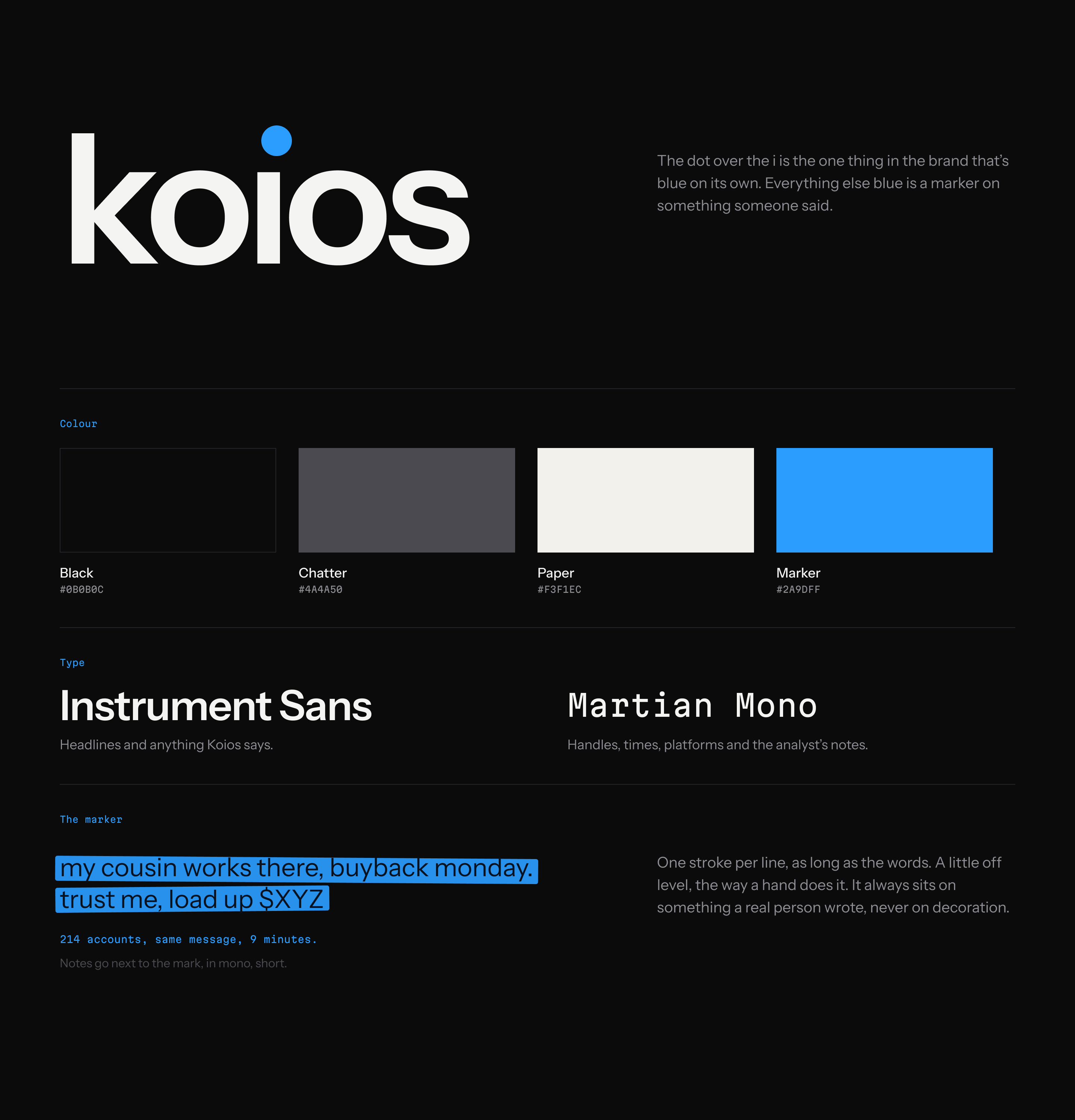
The brand is black, white and one blue. The blue dot over the ı is the only blue that stands on its own. Everywhere else, blue is a marker on something a person wrote: one stroke per line, as long as the words, a little off level.
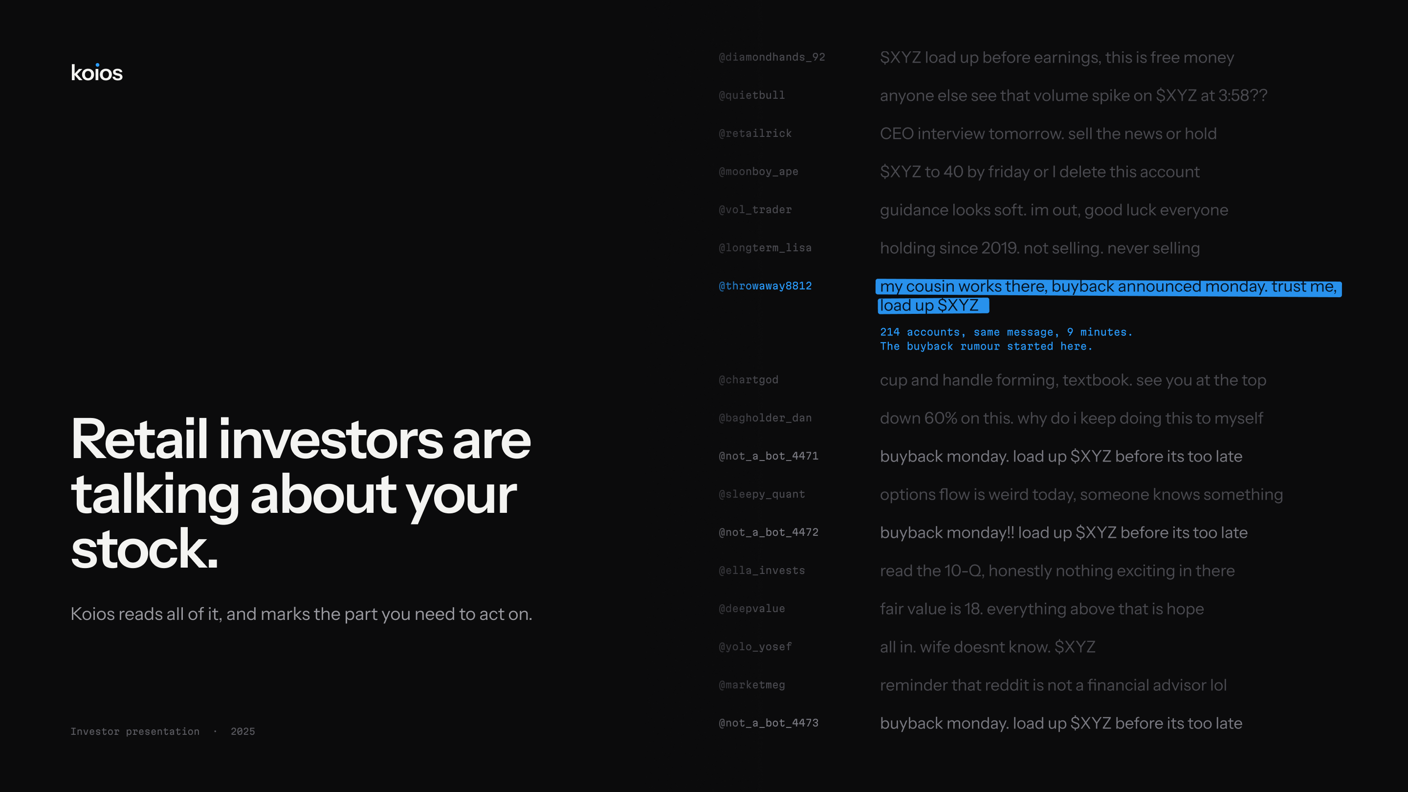
The cover is a wall of posts about a fictional stock, written the way people actually post: someone holding since 2019, someone down 60%, someone who went all in and didn’t tell his wife. One post is marked, a buyback rumour, and the note next to it shows 214 accounts repeating it within nine minutes.
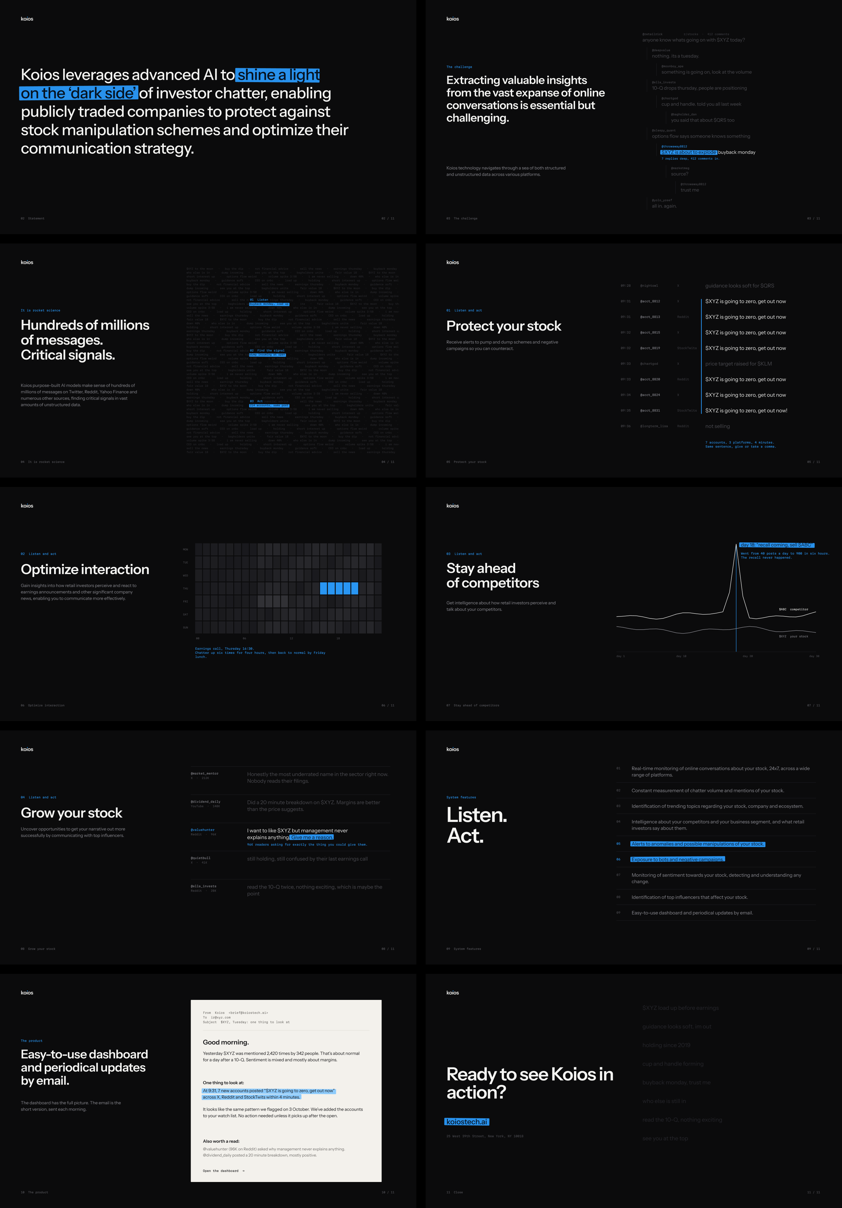
Each of the eleven slides uses the marker in a different way. On slide 3 it’s a reply buried seven comments deep in a Reddit thread, on slide 5 it’s seven accounts posting the same sentence, and on slide 6 it’s the hours around an earnings call.
The site works the same way. The hero is a feed with the rumour marked, and each capability is shown through a small piece of the product rather than an icon.
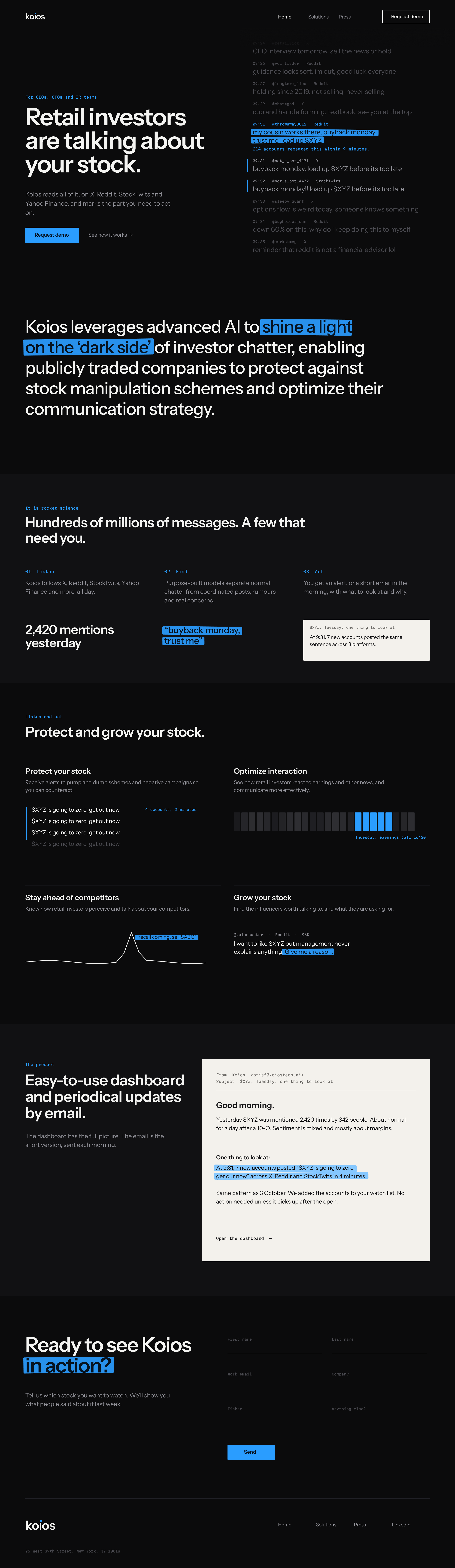
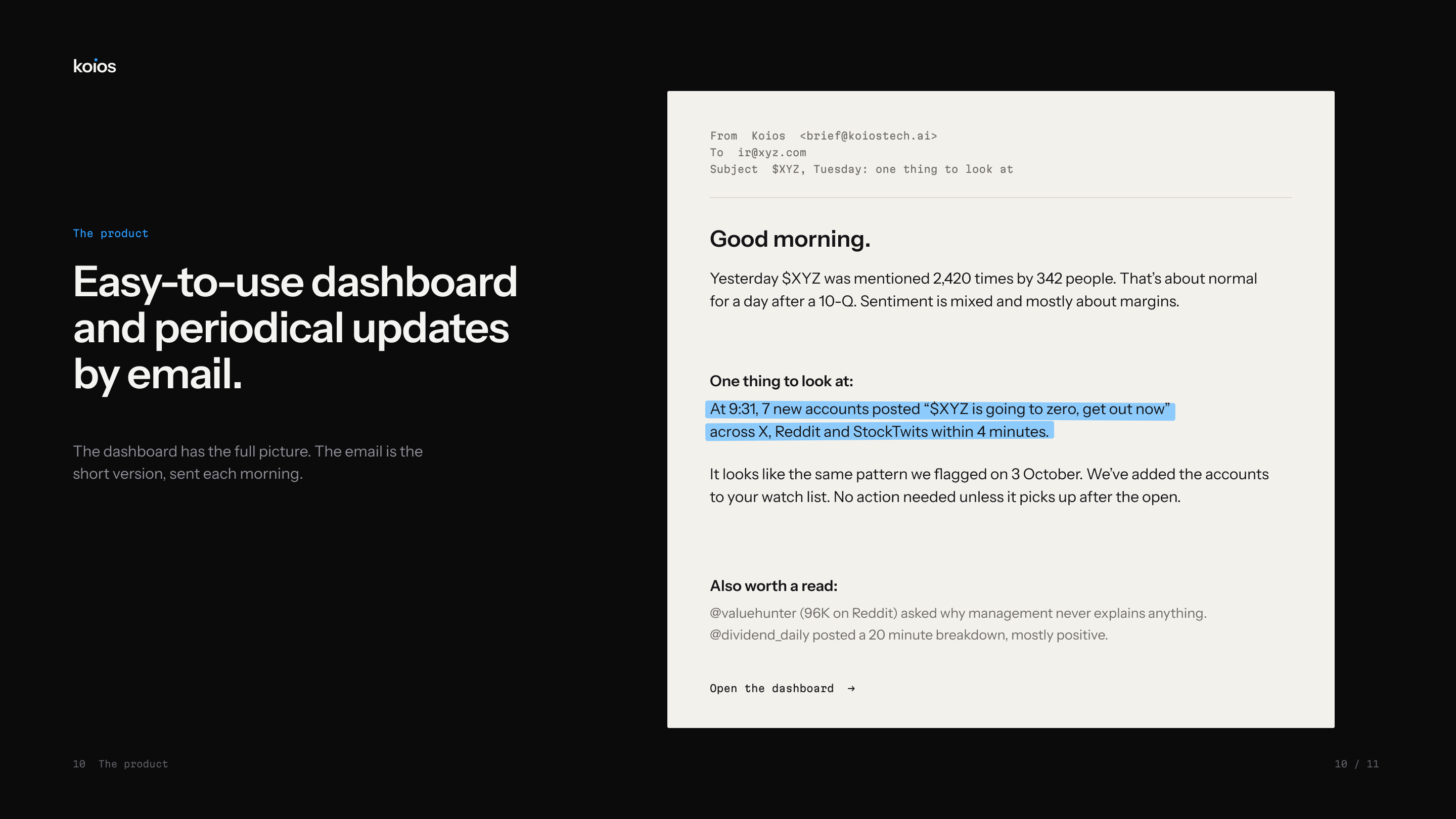
The product slide used to be a dashboard screenshot. I replaced it with the morning email Koios sends. My thinking was that the email explains what the product does faster than a dashboard can. Most of it is plain text, and only the one thing to look at gets marked.